|
|
Post by royalkerryfan on Jan 24, 2022 16:23:42 GMT
New jersey out this Friday the 28th. sweet, any pictures of it? No it's all top secret!... I'm told there's a good chance it'll be green with a gold band on it 😉 |
|
|
|
Post by dc84 on Jan 24, 2022 17:08:39 GMT
sweet, any pictures of it? No it's all top secret!... I'm told there's a good chance it'll be green with a gold band on it 😉 [b Weird I heard the opposite it was to be good with two green bands at top and bottom |
|
|
|
Post by royalkerryfan on Jan 24, 2022 17:33:18 GMT
No it's all top secret!... I'm told there's a good chance it'll be green with a gold band on it 😉 [b Weird I heard the opposite it was to be good with two green bands at top and bottom I hope you're being as sarcastic as I was DC 🤣 |
|
Deleted
Deleted Member
Posts: 0
|
Post by Deleted on Jan 24, 2022 21:14:37 GMT
Oh blagard the new guy 😂
|
|
|
|
Post by john4 on Jan 25, 2022 16:54:59 GMT
This is great
|
|
|
|
Post by royalkerryfan on Jan 28, 2022 8:06:39 GMT
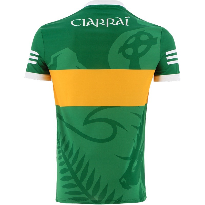
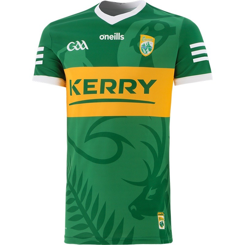
Hate to break it tou you lads but the new jersey is appalling.
|
|
|
|
Post by kerrybhoy06 on Jan 28, 2022 8:15:04 GMT
Hate to break it tou you lads but the new jersey is appalling. I’ve just seen it. It looks like a cheap training top that you’d get in Aldi, who designs these things? I would agree that it’s appalling |
|
|
|
Post by royalkerryfan on Jan 28, 2022 8:21:55 GMT
Hate to break it tou you lads but the new jersey is appalling. I’ve just seen it. It looks like a cheap training top that you’d get in Aldi, who designs these things? I would agree that it’s appalling The last one was bad but this is worse. How hard is it to mess up a green and gold Jersey. They had the template with the tipp shirt. |
|
|
|
Post by john4 on Jan 28, 2022 8:26:06 GMT
Disappointed at first sight, Growing on me a little
|
|
|
|
Post by kerrybhoy06 on Jan 28, 2022 8:28:19 GMT
Disappointed at first sight, Growing on me a little It’s too busy, too much sh*t goin on. I don’t see why we can’t just release a standard, classic looking jersey without any stupid gimmicks. The commemorative jersey that we released last year was an absolute beauty |
|
|
|
Post by dc84 on Jan 28, 2022 8:43:13 GMT
Too busy altogether and gold band isnt great
|
|
|
|
Post by decondd2 on Jan 28, 2022 8:43:41 GMT
I think the lighting in the photographs exaggerates the contrast between the light and drarker greens. It looks more subtle in the video released and it's more palatable.
I don't love it and I don't hate it.
It's better than the last jersey but not as good as the 2018-2019 jersey or the commemorative jersey released last year.
|
|
|
|
Post by thehermit on Jan 28, 2022 8:50:39 GMT
Disappointed at first sight, Growing on me a little  Disgusting, they should have tried to make the commemorative one into the playing one for the next few years. |
|
|
|
Post by thehermit on Jan 28, 2022 8:54:41 GMT
Hate to break it tou you lads but the new jersey is appalling. I don't think either of us will be adding it to our collections Royal!
Any sign of the away one yet, maybe they might redeem themselves.
|
|
|
|
Post by The16thMan on Jan 28, 2022 9:14:10 GMT
I definitely wasn't a fan on 1st view but I think the more I see it the more I'm starting to like it.
|
|
keane
Fanatical Member
  
Posts: 1,274
|
Post by keane on Jan 28, 2022 9:14:15 GMT
Just an inkling that it might be better in the flesh than in the promo shots as someone said above. The promo shots of the commemorative jersey really oversaturated the stuff dyed into the fabric and made it look like a cheap knock off but it's a lot more understated in the real thing. Hopefully this is the same.
Still pretty cat and the whole design process at the moment seems to be basically 'that's a pretty nice lily but surely there's some way we can cover it in gold'.
|
|
|
|
Post by royalkerryfan on Jan 28, 2022 9:18:18 GMT
Hate to break it tou you lads but the new jersey is appalling. I don't think either of us will be adding it to our collections Royal!
Any sign of the away one yet, maybe they might redeem themselves.
Unless my opinion changes on Sunday then no ill not be adding it to the collection. Maybe it's an age thing for me now 😂 |
|
|
|
Post by john4 on Jan 28, 2022 9:30:25 GMT
If one of them take it up the steps of the Hogan stand, till do fine!! 🤔
|
|
|
|
Post by sullyschoice on Jan 28, 2022 9:31:35 GMT
It looks like it needs to be ironed.
I don't like that v neck collar. Has a look of Galvin's Keohane tops.
They always looked to me like someone swung out of your collar and stretched it.
Jury still very much out....and I would buy any auld sh1te they put the county crest on
|
|
horsebox77
Fanatical Member
   Our trees & mountains are silent ghosts, they hold wisdom and knowledge mankind has long forgotten.
Posts: 2,339
|
Post by horsebox77 on Jan 28, 2022 9:41:17 GMT
Christ on a bike... look opinions will differ, i personally have a Grà for the late 80's early 90's, I'm sure some will love it, but I can't see any age group breaking down the doors queuing for this edition.
Last Saturday, some players warmed up in a white jersey with plain light green cuffs, numbers etc...
Unless the 'away' jersey may be more attractive...
|
|
|
|
Post by Attacking Wing Back on Jan 28, 2022 10:18:06 GMT
|
|
Joxer
Fanatical Member
  
Posts: 1,373
|
Post by Joxer on Jan 28, 2022 10:49:02 GMT
Whoever said this forum was full of grumpy old codgers.....will only get that view affirmed by reading this topic   Personally, I think its a very good design and a big step up from the last one....but you know what they say about opinions and everyone having one.....  |
|
|
|
Post by john4 on Jan 28, 2022 10:54:28 GMT
Looks to me like the photoshoot was 'glossed up' to give the jersey a satin appearance, which doesn't appeal to me that much. Looks well in fairness in the action video. I'm beginning to get sucked in!!
|
|
|
|
Post by clubman on Jan 28, 2022 11:12:56 GMT
Not for me im afraid, dont understand why they keep mwssing about with it so much
|
|
Deleted
Deleted Member
Posts: 0
|
Post by Deleted on Jan 28, 2022 12:06:40 GMT
Good God its rotten, the green is too bright.
|
|
|
|
Post by mitchelsontour on Jan 28, 2022 13:41:27 GMT
|
|
|
|
Post by john4 on Jan 28, 2022 13:47:13 GMT
The words of the man who designed the dirty brown yoke!! |
|
Deleted
Deleted Member
Posts: 0
|
Post by Deleted on Jan 28, 2022 13:59:44 GMT
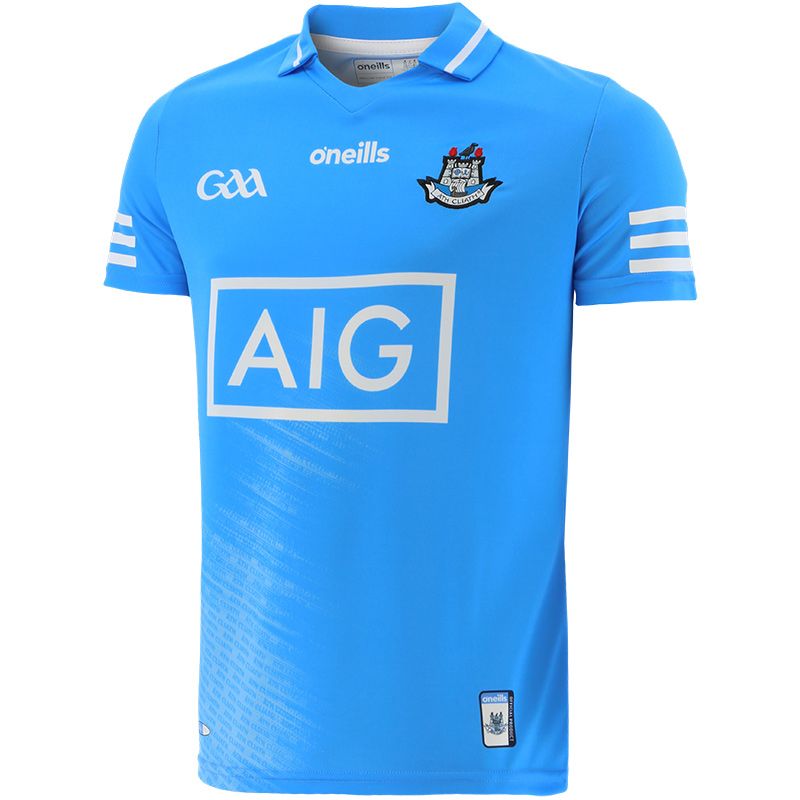
Thats an awful looking yoke. No offence to Pennys but, it looks like a Kerry jersey knock off you would get in there on the run up to an All Ireland Final. Would it have been too hard to go with a style like the commemorative jersey? If they got rid of the stripes on the sleeves and the motif in the material it would be nice. The same from the back. The same template works well on the dublin jersey as its not got the motif    the dublin Jersey looks like a bag of * in fairness, you couldn't do anything to improve it bar darken the blue. |
|
|
|
Post by kerry97 on Jan 28, 2022 14:24:32 GMT
Worst jersey ever . The pattern of the crest being woven into the green is horrendous .
I'm actually struggling to think of a worse intercounty jersey in the past 20 years . Really diabolical stuff .Terrible , truly , truly terrible .
This design has about 4/5 different concepts running through it and they don't blend well.
Concepts :
1. Classic 70/80s plain
2. 00s crest on the sleeves but now woven into the torso.
3.Multiple shades of green , a 00s phenomenon best left their.
4. The "go faster" racing stripes on the sleeves are more banger racing than Formula One .
Awful jersey , like something Norwich City would wear in a League Cup match.
|
|
|
|
Post by royalkerryfan on Jan 28, 2022 14:38:45 GMT
Well it's being Well and truly slated on all platforms.
The jersey is iconic there is no need for gimmicks.
|
|