|
|
Post by kerrygold on Apr 2, 2019 8:26:52 GMT
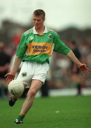
Both Meath & Donegal on Saturday wore versions of Green & Gold in their league 2 final clash. Kerry could adopt both of these versions as their alternative Kit to avoid clashes with all other jerseys out there. There is nothing Kerry about the current alternative kit. When we go to Croke Park we want to see the Green & Gold brand in action.
|
|
The16thMan
Fanatical Member

Posts: 1,004
Member is Online
|
Post by The16thMan on Apr 2, 2019 9:24:34 GMT
Totally Agree. What would be wrong with having something similar to the GK jersey as an alternative strip and using a different design for the GK. Certainly be better than the blue or the gold, would have thought being a former player Galvin would have designed something more suitable to Kerry even though to be fair to him he did solve the issues of the hard to see numbers on the back but the shade of gold he chose was unforgivable in my opinion.
|
|
|
|
Post by Annascaultilidie on Apr 2, 2019 11:03:29 GMT
I don't mind the gold jersey but I think I would prefer a gold more akin to the gold on the green and gold jersey.
|
|
|
|
Post by Mickmack on Apr 2, 2019 11:28:57 GMT
Its not even gold. Its some sort of brown. Its an abomination.
Can they not just bin it.
|
|
|
|
Post by Attacking Wing Back on Apr 2, 2019 12:01:48 GMT
Just did a quick mockup of what i think the kerry away jersey should look like  |
|
|
|
Post by Annascaultilidie on Apr 2, 2019 12:04:27 GMT
Did it not come out a different shade to what we were expecting?
|
|
|
|
Post by Attacking Wing Back on Apr 2, 2019 15:15:16 GMT
If you google 'kerry gaa away jersey' you get different shades of the Jersey in different shops. What we wear is the dark manky looking color but what was advertised was closer to gold.
|
|
|
|
Post by Mickmack on Apr 2, 2019 16:21:54 GMT
Just did a quick mockup of what i think the kerry away jersey should look like looks ideal |
|
|
|
Post by buck02 on Apr 2, 2019 17:08:23 GMT
Just did a quick mockup of what i think the kerry away jersey should look like But what is the theme of your jersey. It needs a theme. Could you not spend your time finding some obscure Kerry person in the 1930s who once had to tie up his yellow jacket with a large green scarf around the centre when the buttons were stolen. In the process, this once forgotten genius, created a trend for the people in the parish who all ended up going to the dance wearing yellow coats with a green scarf around the centre of it. Then O'Neills and Kerry GAA might take a look at creating your design  |
|
|
|
Post by southward on Apr 2, 2019 17:15:22 GMT
Thing is, I haven't noticed many people buying or wearing them, which is usually the motive behind new kits. Can't understand why the County Board have persisted with them into a second season.
|
|
|
|
Post by Mickmack on Apr 2, 2019 18:17:27 GMT
Just did a quick mockup of what i think the kerry away jersey should look like But what is the theme of your jersey. It needs a theme. Could you not spend your time finding some obscure Kerry person in the 1930s who once had to tie up his yellow jacket with a large green scarf around the centre when the buttons were stolen. In the process, this once forgotten genius, created a trend for the people in the parish who all ended up going to the dance wearing yellow coats with a green scarf around the centre of it. Then O'Neills and Kerry GAA might take a look at creating your design what is the theme for current away jersey ....some outbreak of dysentery somewhere in Kerry in the 1940s |
|
|
|
Post by Kingdomson on Apr 2, 2019 18:37:27 GMT
The current colour of the Kerry alternative jersey has the look of something you don't actually want to see just flush down the bowl!
If we must change from green&gold, I thought the munster blue with gold piping we had for years was a nice alternative and I never heard complaints like we do now. Kerry in that hideous black&tan outfit on Sunday and not in their traditional green&gold lost of some their majesty. I wonder, what are the sales for the current alternative shirt? Who the hell is buying it?
|
|
|
|
Post by Kingdomson on Apr 2, 2019 18:44:10 GMT
Thing is, I haven't noticed many people buying or wearing them, which is usually the motive behind new kits. Can't understand why the County Board have persisted with them into a second season. Good! Perhaps there's some contract with the designer to keep it for a certain length of time, I'm only speculating. However, the sooner it goes, the better. |
|
|
|
Post by sullyschoice on Apr 2, 2019 18:46:37 GMT
The black version ( keepers jersey) is class. It's not Green and Gold but it is my favourite Jersey of all time.
|
|
|
|
Post by wayupnorth on Apr 2, 2019 19:05:10 GMT
Just did a quick mockup of what i think the kerry away jersey should look like That’s more like it! Coincidentally I see Wolves playing Manchester United now. Wolves wearing a gold jersey which isn’t far from this. Very striking colour and miles better than the ditchwater dull number that passes for Kerry “gold”. |
|
|
|
Post by veteran on Apr 2, 2019 19:35:42 GMT
Thing is, I haven't noticed many people buying or wearing them, which is usually the motive behind new kits. Can't understand why the County Board have persisted with them into a second season. Glad to hear of slow sales or no sales. We could be waiting for a long time for the Kerry County Board to act. Remember how long we were complaining about the illegible numbers on the jerseys. Paul did a fine job with the new green and gold jersey but he has a lot to answer for with the faded petticoat effort. What was he thinking’? This was a man who spoke so passionately before the 2007 final against Cork saying it would be a denial of Kerry’s football heritage were they to lose that final to our neighbors in Croke Park.. And yet he comes up with this monstrosity.. Are we to assume that this spooky design is in some way emblematic of this county’s football story. |
|
|
|
Post by Annascaultilidie on Apr 2, 2019 21:46:35 GMT
I am convinced that there was a mistake between design and production and the produced colour is not what P Galvin had in mind.
|
|
|
|
Post by Attacking Wing Back on Apr 2, 2019 22:17:13 GMT
I am convinced that there was a mistake between design and production and the produced colour is not what P Galvin had in mind. Tbh I think you might be right. The colors on the press releases look a lot brighter |
|
|
|
Post by themanfromthewest on Apr 2, 2019 22:24:15 GMT
The black version ( keepers jersey) is class. It's not Green and Gold but it is my favourite Jersey of all time. That will be my next purchase, lovely bit of kit. |
|
|
|
Post by baurtregaum on Apr 2, 2019 22:46:16 GMT
I am convinced that there was a mistake between design and production and the produced colour is not what P Galvin had in mind. Tbh I think you might be right. The colors on the press releases look a lot brighter I have noticed that the 2000 jersey (home) was available in a few different shades of colour. Has anyone else here ever noticed that? I agree with Annascaul that the jersey online and press releases is a different hue and looks nicer as a result. This "gold/champagne" jersey is like marmite. I will put my head above the parapet here and say that I actually kind of like the jersey and I believe it has sold well since last year. I certainly saw enough of it at matches I attended last summer anyway, mostly on supporters under 30. It is (at a stretch) gold and therefore at least uses one of our colours. The Mayo one is blue, a colour which has has no link to county or province. Not that they care this week. One change I would have made would be to have the trim and shorts a dark green, not black. This would be more in keeping with tradition. I always liked the Munster blue but alot of people on here complained about it. Let's be honest Kerry should always be in their traditional colours and having finished above mayo in the league table should have that option in the event of a colour clash, but these alternative strips must be promoted. I read somewhere that the actual Kerry alternative strip registered with Croke Park is something like the 1982 jersey - something like Finuge's jersey. |
|
|
|
Post by veteran on Apr 3, 2019 8:09:43 GMT
About the suggestion that there is a discrepancy between design and production, surely if that is the case Paul would challenge the County Board saying this is not what I had in mind. It would be a surprise if a designer of Paul’s stature would stand over such a product , assuming of course that the jersey as is was not what he planned.
|
|
|
|
Post by kerrygold on Apr 3, 2019 8:20:07 GMT
Agreed vereran, the colour of the togs & socks suggest this is the colour shade Paul had in mind. There are some lovely versions of green & gold jerseys across many different world field sports. It would be nice to create a really nice Green & Gold alternative jersey. We shouldn't delude the Kerry Green & Gold brand. It defines Kerry. It stands the hair above in Croker.
|
|
|
|
Post by taggert on Apr 3, 2019 8:45:37 GMT
An excerpt from an article in the examiner in Feb 2018 below, where Niall O'Callaghans response to a question on the colour of the jersey seemed to miss the entite point - that colour, not the design, the detail or visibility of the number! Is there a duller more insipid version of Gold we could have picked - its actually draining to look at it, let alone wear it...
Answering criticism about the colour on local radio, he said: “People needed to see the gold jersey in the flesh. When they did it was a different ball game — it was heavily embossed at the back and Paul Galvin had brought a lot of imagination and detail into it.”
|
|
|
|
Post by glengael on Apr 3, 2019 9:30:06 GMT
It's not gold, it's manky brown. Dull draining brown. I don't know how long it's going to be in production for but the sooner it goes, the better for me.
|
|
|
|
Post by royalkerryfan on Apr 3, 2019 9:35:35 GMT
If the county board could bin the white jersey in 2001 after one game they can bin this awful kit.
The white kit was actually nice.
|
|
|
|
Post by buck02 on Apr 3, 2019 10:05:55 GMT
If the county board could bin the white jersey in 2001 after one game they can bin this awful kit. The white kit was actually nice. First you say your delighted Meath are back in Division 1 and now you compliment that white kit. You have definitely spent too long living up there! |
|
|
|
Post by royalkerryfan on Apr 3, 2019 11:59:18 GMT
If the county board could bin the white jersey in 2001 after one game they can bin this awful kit. The white kit was actually nice. First you say your delighted Meath are back in Division 1 and now you compliment that white kit. You have definitely spent too long living up there! Hahaha yes Buck but that was a dark day for me up here.. |
|
|
|
Post by Attacking Wing Back on Apr 3, 2019 15:51:24 GMT
Loved the white jersey to be honest.
|
|
|
|
Post by sullyschoice on Apr 3, 2019 15:59:08 GMT
Up to now the white Jersey is one of the only jerseys I haven't bought since around 1975. Jaysus they were itchy yolks back then.
|
|
|
|
Post by shaggy04 on Jul 21, 2019 13:22:44 GMT
Much prefer the meath shade of gold to our own,I presume we'll wear home Jersey against meath in 2 weeks time,unless we have a '3rd' Jersey
|
|